Sunday, 31 January 2021

Project sign off

This is the project sign off that i had discussed and complete with my tutor.
And at the following term, I will be carry out with this project.


Project Plan : pro-form

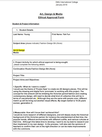
I had filled up a pro-forma to record my initial project idea of designing six different styles of the same period collection. Below is describing the way I research, what I would use for my design, what plan for my following week... make sure that I can catch up the schedule, and finish the work on time.


Initial research on the idea development

In the following blog post, I will research some information which relates to my art portfolio project topic ‘Purple Haze’, for instance looking at some different fashion designers, the fashion history backgrounds of Victoria period, definitions of ball gown...There are lots of researches that I am very interested in, hope these scopes can help me to develop more completely, provide or inspire some ideas for the project works, to be more clear to identify the purpose of my creation.


As I mentioned from the class development exercise that I want to associate and relate what I am interested in, this project's concept is all around my favourite historical inquiry, one of the UK's most popular 19 century - Victoria period. I am really absorbed in this medieval generation, I love the way they dress and culture, everything, however, I know not much about this, therefore I have to understand and study with the cultural history of this period, such as their fashion, dress etiquette, design structure or what familiar materials they use... A comprehensive understanding will be very useful for me to develop with my own creation.

The first designer that I would like to look at Valentino Clemente Ludovico Garavani. Valentino is a well-known and a recognized legend in the fashion industry. The iconic colour "Valentino Rosso" , the red colour is most famously used in his couture dresses and it just brought out a strong unique design style.

 I have heard of his brand before, but I didn't have much in-depth research on his work and his biography. According to that I would like to know more about how he uses only red colour on the haute couture dresses that he designed and express them into different styles at the same time, or how he fits the characteristic of classical romanticism into the standards of today's society, the way he balances between two different centuries and attracting a global following, falling in love with his collection. Hope it can get some answers and will be inspired by this research.


The next designer : ​Cecilie Bahnsen. I was attracted by her simple and clean design, also the use of those interesting materials. Every doll dress are given off the sense of femininity. This elegant, easy design style makes me want to see more about other of her works. It would be good to research in more detail,  maybe I can get some design inspiration in it


I also want to research and study digital form design and explore more in the iPad app 'Procreate'. If you have followed my blog before, you probably know that I had used it for the first semester art project. For the whole collection, I only used a ‘brush’ to create those six designs, it seems nice with the final but I want to challenge myself, trying to bring out the texture of different materials through using 2D graphic design.  The rendering of watercolors, the texture of see-through materials...I am still not sure what texture I want to create and how I can work with it, so I may research some drawing technique on the Internet or blog post, try and practice after studying, to achieve my ideal effect to be more perfectly.


The theme is ‘Purple Haze’, so I definitely have to follow this direction to explore the color, what happens if I combine purple and other colors together. What effect or chemical reaction will it bring out? I would list them out as an example, so as to make everything easier and clean, especially when I need to match the suitable color for different styles of the project collection. Develop and find out what it means for my fashion design. I would research deeply for the following blog post.


Reference:

Lawrence,N. (2016). The Victorian Era: the Romantic Period. [online] GLEEM LIFE. Available at: https://gleemco.wordpress.com/2016/01/05/the-victorian-era-the-romantic-period/ [Accessed 5 January 2016].

Saturday, 23 January 2021

Class task - Fishbowl Method

In today’s session, we were going to have a seminar discussion, using the fishbowl method to present our project ideas to the classmate, have a chance to speak and listen to different opinions, exchange ideas from each other, this would be a good opportunity to develop our own project. At the beginning, our tutor Zoe had selected five similar progression route people to go inside the fishbowl, they would take turns to present their project ideas, for the rest of the other classmates would listen and ask the question, give some recommendations for each other. Before we started this session, I had to prepare what I'm going to present, so as to make sure everyone knew what I was working about and also the concept. I thought this was quite helpful for me to confirm and be more clear with my development direction when I was actually writing out the note. 


This discussion was very beneficial, in particular for the circumstance I can know what other classmates of the same progression route have any idea with their theme and their research direction. Although I was not in the circle for the first and second round, I could not recommend any opinions, however listening from their discussions and the comments that they had talked about in the fishbowl, I realized that maybe I also had the same problems, for instance Is it in my power to accomplish , whether they can be finish on time, would it be too complicated and whether complex design concepts would be too impractical. I must consider these questions. Ensure that I can express different visual effects with six of them in the same color. 

Under the virtual environment of this session, we can understand and learn from each person, helping and making suggestions for improvement. This can absolutely improve the communication between classmates, and also make us more dedicated to the course.  I also found that my presentation skills were immature and needed to be improved, it would be indeed for the future no matter for the lecture or for the work environment. I think we can do more practice with this exercise, that can be sure we are heading in the right direction, and continue to listen to everyone's different perspectives. Perhaps we can realize that we have a lot of questions that need to be improved.

Reference :
Free Training Materials, Exercises, Ice Breakers & Roleplays | Skills Converged. Available from : https://www.skillsconverged.com/FreeTrainingMaterials/tabid/258/articleType/ArticleView/articleId/1176/Fishbowl-Conversation-Technique.aspx [Accessed 25/02/21].

Tuesday, 19 January 2021

SMART Objectives 2


During this class session, we are going to plan our smart objective for my project.

SMART Objective :
It can help to cre­ate, track and accom­plish, short-and-long-term goals efficiently.

1.Specific- What do I want to create?

I would use the theme of 'Purple Haze' to create six 2D designs pieces. This will be using the drawing and digital form 'procreate' to working with this project. The concept for this artwork will be imitating the Victoria period fashion, six sets various skirts of different classes at the prom and all of them will be perform in different styles. Although they are the same with purple color, different match up will be bring out another visual effects.


2.Measurable- How will I know that I achieved this?

I would do more research of different designers, and will deeply study the historical background of the Victorian period, for instance the entertainment at that time, the popular trends, different environments with different outfits, and various cultures at that time.  Although this takes time to develop, I want to do my best to research and then implement in my own design.  In the process, I will also ask the opinions of teachers to confirm that I am in the right direction or can be make improvements with the commons.


3.Achievable- Is it in my power to accomplish it?

I had used the app ‘Procreate’ to work with my design at the last semester, so I am quite familiar with the tool and drawing skills, and also I did spent some time to explore the use of the Photoshop, watched some introduction video about the app in youtube, so I probably learned its basic editing technique. I believe I can and I will do my best to perform the things that I had learned and complete these six designs in a high quality way.


4.Realistic- Can I realistically achieve it?

After the horrible experiment of the last semester, I will follow the timetable that I set rigorously, being more self-disciplined to follow the progress that I had set, making the target clear will enable me to complete the work efficiently.


5.Timely- When exactly do I want to accomplish it?

The deadline of this project is 16th of March, so it means there are eight weeks to let me finish my designs, even if it seems there is enough time, but I would like to complete it earlier, just want to be make sure is it any missing or any place that I need to modify, so that I can reflect the artwork and correct before the deadline.


Monday, 18 January 2021

Class development exercise

For this session, we are going to pick one method to develop my ideas.

Method One: The Meditative Approach

Method Two: Mountain & Valley

Method Three: Make a Flag


I have chosen the method one: The Meditative Approach. When I started to choose my eye and sit for 5 minutes, trying to relax and keep my mind clean, because I had to think about the theme again that I had chosen so that just helped me to stay focused . As I had mentioned in the last few posts, Purple just gives me an impression of jewelry, being gorgeous and noble. And I thought about those people who were worn by nobles in the middle century. I wanted to connect my interests. I am a big fan of movies, especially the 19 century of Uk, no matter the history or even the medieval costume designs, and then there were some movies that just came out of my mind, such as Pride and Prejudice, Bridgerton...

The draft that I developed :


Saturday, 16 January 2021

Lecture Artist Research : Odilon Redon

 In today's class session, we had a lecture about a French artist Odilon Redon. We viewed about his biography, explored some of his artwork and how the change was with his earlier and later life. Our tutor Zoe had an almost 30-minute long introduction for us to know more about him, I had dropped some notes and this blog will be showing you who he was and what he had done in his life.


 Odilon Redon was born Bertrand-Jean Redon in Bordeaux, France in 1840 and his name Odilon came from his mother's name Odilon. Although he was already an symbolist artist of France, he had a much greater reputation in the United States. Redon started to study drawing when he was 15 years old, however his father insisted that he should study architecture so he switched to this subject but failed the exam at the end, therefore he went back home and started to study sculpture again.

It can be seen that Redon's paintings clearly distinguish with two different stages. The colors of his early life paintings are dark and mysterious until 1890s, in his later life, he had begun to work in oil paintings and pastel works, and the colors started to become rich and contrasted.


Due to his childhood background, he had been a sickly child, liked to be alone and he just felt safe hiding somewhere, so this was the reason how he started to form his own unique weird style in his early life. Redon used black as the most basic color and lithographs or charcoal to depict the silent and strange creatures that inhabited the dark fantasy world. For instance strange snakes, eyeballs suspended in the air, horses with wings... 


Redon began to try to create with oil painting and chalk in his later life, those themes he had been changed to flowers, idols or beauty women. All of the black tones in the past had also become colorful and bright paintings.


Reference :
1.http://arrinconarte-elrincondelarte.blogspot.com/2012/04/odilon-redon-una-puerta-abierta-los.html
2.https://www.portraitonpastel.com/en/odilon-redon-pastel-technique
3.https://www.flickr.com/photos/24605060@N08/2361914097/
4.https://www.buzzfeed.com/juliapugachevsky/what-your-favorite-high-school-book-says-about-you


Wednesday, 13 January 2021

Set project : Ideas Generation

Today this session is going to have an ideas generation of our continuation route, however we need to show and draw out the ideas to the Martians without words, let them know our concept of the project. As I had said in my last blog post, I choose the Purple Haze to be my main topic. Therefore here are some concepts that I had come to my mind.

The purple color reminds me most of the positive and beautiful things. What I have come out of my mind? The lavender in the countryside, those bright purple soft color flowers looms through the green fields, this wonderful sense which also makes me think of some little buddy who lives there: butterflies, bees...some interest. Purple makes me think about charms.The bad characters Ursula in the mermaid story are all characterized by her evil characters in purple and gray color, therefore her black and dark magic makes me think of the mark of charms. As I said in the last post, purple can be used in the funeral, so the negative aspects will remind me about the tomb and the purple bruises on the body, more negative emotions and the feeling of loneliness. Here are the basic ideas that I initially thought of for my art portfolio.


Set project : First thoughts

In this session, we are going to set up a project theme in our continuation route and there are three topics that we can choose : Purple Haze, Earthly Delights and Expressionism. I am quite interested in ' Purple Haze' the color purple as my art portfolio theme. However, this topic can contain lots of things, it can be including the emotions, environments, objects or even characters... there are lots of things can be develop with.

I think purple always feels like a luxurious, magical, mysterious color system, just like the temperament processed by those nobility, this is my first impression of purple color. And then I have done some research about ‘Purple Haze’, I am surprised that the meaning of purple is very bipolar, it can be represented into two totally different emotions and meaning in different counties. 

Positive : Most of the Eastern countries. Purple represents nobleness and has a lofty reputation as the same as I think. For instance in the past for Roman Empire, only the royal family could use this color. Under the religious system, purple represented a symbol of honor and prestige. Another example of Japan, the royal family again, is very respected with purple, because it just represents the worship of the North Star in ancient China.


Negative : Some countries would have a different side of this color, they wouldn't use purple so as to avoid those contraindications. For Brazilians, purple means sadness, the decorations and flowers in the funeral are all with purple color. Women in Thailand also wear purple jewelry to reflect the mood of mourning for their deceased husband. It can be seen purple for some counties are an expression of pain and sorrow for people.


It is interesting that the evolution of various religions, cultures and times have led to different interpretations of ‘Purple’ in each country. In addition, I have also found that the different combinations group with purple will also show the different visual impressions. For example, purple + red violet can show a sense of fashion and nobility. If matched with the contrasting colors, purple + light yellow can bring out a vivid and active style, it’s just giving people a sense of excitement. Matching a wrong color can carry out an obscene impression, the combination of azalea + dark gray, it would feel melancholic and uncomfortable for me, and even think of some internal organs or corrupt objects. 

Different color matching can bring out lots of characteristics, which means it’s quite important for me to think about my design carefully, how can I express the color of purple, how can I match the color to bring out the scene that I want...hope to get to know more deeper in the following research and would be continuing to explore in this topic.


Reference :
1.https://i.pinimg.com/originals/dd/77/d8/dd77d8c99946df5ac173d40dcb42a58c.jpg
2.https://mybackpackblog.wordpress.com/2014/04/24/the-purple-parade-of-pain/

Monday, 11 January 2021

Ice Breaker - Self Portrait

Today’s session we had a warm up icebreaker exercise first, we needed to draw a self-portrait within 15 minutes and it can be using any different media. Therefore, I decided to use digital form to create my self-portrait, using the ‘ Procreate’ app of iPad was useful to choose different colors in a short time efficiently.
I wanted to draw a colorful and eye-catching work, so I did a research and got the inspiration from an artist Lui Ferreyra.

Lui Ferreyra is a American artist who born in Meican, he worked with heavily features geometric shapes and forms, also he used lots of rich colors in his artwork, so it can be seen he was really good at color aliasing techniques and creating an illusion effect. Lai had said that ” I think of my work as a revivification of the impressionist movement, but with a 21st-century technological slant.” . He was very absorbed to be working in the digital age, and if you observe his artwork detaily, you can know that there were combining different groups of mathematically designed elements that interact with the matrix overlay, not just simply sketching the short line to form a picture. 


I like how he used the color in his work, combining different elements to form a character, therefore I imitated the sketching and color style that he had used, and then started to create my own portrait. I opened the app and chose an A4 Size paper document.  In order to make it be more clean and outstanding with the color, I kept the original white background and then selected the ‘6B pencil’ in the tool box. Before starting to sketch, I had also clicked the upper right position of the color template, so as to let the picture be more vivid and bright-colored all the time. After setting up the whole thing, I sketch out the lines of the facial contours with my selfies which were taken by my phone first. Most of the facial features and even the neck were created with high-brightness color tone : tangerine, lemon yellow and red, these can be discrete the shapes of color as highlights and shadows. During the whole process, I kept sketching with ragged and cross-hatching, it just helped to fill up the color quickly in time. In order to highlight and contrast with the facial color, I decided to use a cold color tone to sketch the hair in a wide range, ultra marine and iris purple added a sense of fashionable feeling to the whole picture. I was quite happy and satisfied with the result, but if I had more time, I would sketch with a short line and build up the facial creature more detaily.

The final result : 


Reference :
1. LUIFERREYRA.COM
 https://www.luiferreyra.com/profile/
2. Prismatic Sketches of Hands and Faces by Lui Ferreyra
https://www.thisiscolossal.com/2016/12/prismatic-sketches-of-hands-and-faces-by-lui-ferreyra/
3.
https://www.amexessentials.com/interview-with-lui-ferreyra/#:~:text=Bold%20colours%2C%20shading%20and%20geometric,but%20also%20extends%20beyond%20it.


Welcome Back

 Welcome back to my blog!
Today is the first school day of the spring term. After a holiday, it has been a new semester again. This term, we are going to use the blogs for the art portfolio. I am really excited to use the skills and learn something new to create my work. Combine the past that I had learned and see is it any improvement or change between this semester.

I have reviewed myself and read the feedback by the tutor carefully. In the last semester, I was terrible with time management. I found that I always put all the schedules together, and finished them at the last moment. It just felt very stressful and overwhelmed. At the same time, due to the fact that there were late updates of those blog posts, it was difficult for the tutor to comment and provide guidance for me to improve the work. Therefore, I had to set a timetable for myself, hope it can help enhance and organize everything being high efficiency and well planned. I also would like to improve the reference information. In the first term, we did not have to reference exactly and too seriously, so I would have a look at the course referencing material that we had taught before, and learn how to use it in the blog post correctly. 


In addition, I want to get out of my comfort zone and don't draw the conclusion immediately, try to explore and develop more about fashion knowledge deeply. The art portfolio of last semester, I had only used three to four fabrics to design six pieces of collection. I think I am quite lacking in fashion design information, so I have to work harder for the coming portfolio. Not just only the pants or short skirts can be shown in the work.

Due to the fact that the covid 19 is too serious and the UK has been locked down, all the flights are banned, therefore I just have to stay at Leicester for this Christmas holiday. The fortunate side of the misfortune, I had a great time to develop with my drawing skills, for instance using the app’ procreate’ to outline characters, watched some youtube video which about using photoshop to edit a picture... And also I had the time to relax and chill with the Netflix reality show - NEXT IN FASHION.

Next in fashion is a Netflix reality show. I love each of them and every competitor is very outstanding. Some of them are already designers of well-known international brands or personal brands, some are even just for interest. There were some sessions needed to be worked in a group to create a piece of collection and due to the fact that everyone had their own unique style and strengths, so there was some chemical reaction when they were required to cooperate with another different style designer. I thought it was really interesting to see their cooperation and how to communicate in the competition. Despite this, each of their final works was very amazing and breathtaking. Especially the South Korean designer- Minju Kim, who finally won this design competition. I love every single piece of her design. Her use of colors was bright and brazen. The tailoring and practicality of each scene was always eye-catching. Highly recommended for those who like fashion design, if you watch carefully there are hiding lots of surprises in this reality show. Hope you will enjoy it!


Reference : 
1.Next in Fashion season 1 review: the Hell’s Kitchen of fashion arrives on Netflix
https://holrmagazine.com/alexa-chung-tan-france-want-to-know-whos-next-in-fashion/
2.Back to real life after reality TV
https://www.straitstimes.com/lifestyle/fashion/back-to-real-life-after-reality-tv