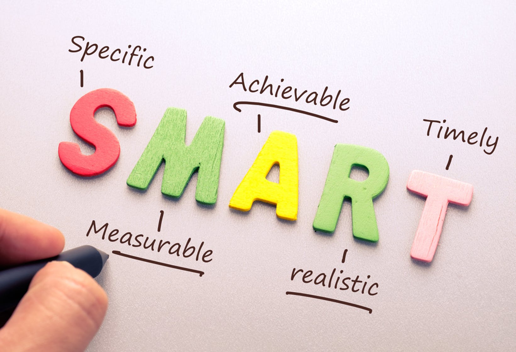
Sunday, 18 April 2021

SMART Objectives 3


SMART Objective :
It can help to cre­ate, track and accom­plish, short-and-long-term goals efficiently.


1.Specific- What do I want to create?
I would use the theme of 'Primitivism' to create four 2D flat designs and one piece of 3D design. 2D designs will be using the drawing and digital form 'Procreate' to working with; 3D design will be using different fabrics and sewing by hand. The concept for this artwork will be representing the Africa primitive culture, inspired by one of the Disney programme 'The Lion King' and also the 'Black Panther' dress up design. For this project, my target audience will be the focus on the ages 18 to 40 years old. Either Students or even women work at a high-stress job outside the home, they are not required to iron or take their clothes to the dry cleaners. The design will be easy to put on and would not cause any wrinkles. The aim of this collection is practical, colourful and fashionable, therefore I have to make sure that the design can present these elements at the same time.


2.Measurable- How will I know that I achieved this?
I would base on the research and development that I had done, elaborate the information and then create my own design. I haven't actually used the fabric to work out before but I believe that I had the 3D media process experience of the last term, I will do my best to perform the things that I had learned, search the sewing technique on youtube and complete the designs.


3.Achievable- Is it in my power to accomplish it?
Same as the last semester, I had used the app ‘Procreate’ to work with my design, so I am already quite familiar with the tool and drawing skills. However, I do want to challenge myself, if it's possible, the works will be presented from multiple perspectives, no longer limited to only the front side.


4.Realistic- Can I realistically achieve it?
After the reflection of last semester, I will try to do the research more comprehensively and deeply, no matter the designer or the cultural information, keep reflecting with myself and ask if there is any question. Try to recorrecting the mistake that I have made in the last two terms, follow the timetable that I set rigorously, this is really essential to have a plan, especially for this project, making the target clear will enable me to complete the work efficiently.


5.Timely- When exactly do I want to accomplish it?
The deadline for this project is the 8th of June, so it means there are seven weeks to let me finish my designs. As I know there is no more deadline after the 5th of May so I think I can be focus on this project. I would like to complete it earlier, just want to make sure is it any missing or any place that I need to edit so that I can reflect the artwork and correct it before the deadline.


Thursday, 15 April 2021

Set project: first thoughts

There are slightly differences in this art portfolio project, we had to create s set project which bases on our continuation route as the same as the last two terms, but using one of the themes to create four 2D and one 3D collection designs this time. Therefore, in this class session, I will look at and discuss about the initial ideas base on these themes.

Topic:
1.Oriental Surprise: Explore the art of the Orient both traditional and contemporary
2.Primitivism: Enjoy a ride into the past. 
3.Ultimate Black: Create your pieces using the colour of night.

1. Oriental Surprise


As an Asian, I am quite familiar with the Eastern culture, and the theme Oriental mean associated with Eastern Asia is China. When I was in high school, I created a lot of works that related to these traditional cultures in my minor subject visual art. As a result, I have mastered a lot of basic knowledge base on the China traditional culture. On the contrary, the native culture of where I was born - Hong Kong, is relatively new and emerging, so the history of here and changes are not as strong and diversified as those of other countries. Surely, the Oriental tradition is not only about China, but also about India, Vietnam, Burma and other places. As I had mentioned in the previous post, I am really interested in history, whether it is Eastern or Western countries, and I am full of enthusiasm about these stories. Also, I know most of their cultures are full of colours and unique pattern, accordingly I am very excited and interested in this topic. Being able to get in deep with their traditions can be an intellectually and rewarding experience.


2.Primitivism


When I look at this topic, Primitivism reminds me to think of the primitive culture of the anthropic age, which is full of nature, with plants and flowers as a basic concept, or simple patterns painting on various historical walls. Also In the primitive state of culture, there are no exquisite clothes. Sam had shared with us a website: Primitivism and Modern Art in the class, there is some introduction about primitivism and what I sum up about the article is all around shoddy and negative, it's quite complex with the definition. Obviously, I'm not really familiar with this them but I would love to have a try and challenge with myself.


3.Ultimate Black


Finally, Ultimate Black. This colour gives me a sense of nobility, power and even mystery, but at the same time, it can also feel like cold or deep oppression. I think black is very easy to match with others colour, and it can also bring out the contrast, make others being more stand out. Therefore I think this is really a versatile colour for creating artwork. The Colour of Night. the first thing that pops up in my mind maybe is the same as most people, the stars in the sky, the universe, planets with various colours, or even the theme of magic and constellations. The most significant sign that reminds me of is the little black dress of Chanel, the classic and elegant design never goes out of fashion. I think ball gown the evening dress is quite suitable for these themes. I am interested in this theme and have some ideas about this aspect, but when considering the last term, I also created a collection themed by colour ' Purple Haze'. In this creation, I want to try something new and see how far I can push myself, to create different colour variations besides monochrome.


Reference:
African Clothing. [Online] Contemporary African Art. Available from : https://www.contemporary-african-art.com/african-clothing.html [Accessed 16/04/21].
Tribal Ethnic Colorful Bohemian Pattern With Geometric Elements, African Mud Cloth, Tribal Design. [Online] Freepik. Available from : https://www.freepik.com/premium-vector/tribal-ethnic-colorful-bohemian-pattern-with-geometric-elements-african-mud-cloth-tribal-design_1552705.htm [Accessed 16/04/21].
Primitivism - Important Art. [Online] The Art Story. Available from : https://www.theartstory.org/movement/primitivism/artworks/ [Accessed 16/04/21].
Primitivism | Music 101. Available from : https://courses.lumenlearning.com/suny-musicapp-medieval-modern/chapter/primitivism/ [Accessed 16/04/21].
12 zodiac signs constellations set on dark vector image on VectorStock. [Online] VectorStock. Available from : https://www.vectorstock.com/royalty-free-vector/12-zodiac-signs-constellations-set-on-dark-vector-21600528 [Accessed 16/04/21].

Wednesday, 14 April 2021

I Hate Art: The starry night

Today session is going to discuss one artwork that we do hate, and this can be an experience for us to learn how to speak our opinion and be critical. 

Most of you who are visual arts students must hear of his name or even seen his work, before Vincenti Gogh. The starry night is one of the most magnificent pieces of art in the world. Even you are not an art student, you would still hear about this beautiful painting before. Unfortunately, The Starry Night has become one of the paintings that I hate the most and here is the explanation of the reason why.

I have been interested in art ever since I was a child. I participated in every visual art workshop in primary school and also in high school actively. Due to the fact that Van Gogh was involved in lots of different medium creation, he had a wide range of well-known and famous artwork. His footprints can be seen in almost all kinds of paintings, including landscapes, still life drawing, portraits, and sketches. Base on this reason, the name of Van Gogh has been always mentioned by the Visual Arts teachers. Therefore I had lots of chance to get to know his works over the years and re-created the drawing based on his painting style many times. I really admire Van Gogh's works, especially The Starry Night is such a legendary figure, and I agree that his paintings are definitely an important factor in art history.


However, as more as I work with this artwork, I started felt annoying and abominate with this picture. The Starry Night always reminded me of the year in high school. In the high school examination, students who study visual arts had to complete a visual arts appreciation within 45 minutes and finished a drawing. In order to prepare for it, teachers are often using this painting as an example, and this painting always being the course material for practising the expression style. I created and imitated his impressionist star night style every single year, which I was begun bored with and hate for this painting. Since then, The Starry night has been crossover with lots of brands, you can see it anywhere on everything, from clothing to shoes or maybe the phone case. Even when I came to study abroad in the UK, 2D3D in the last two semesters also mentioned the scope of his creation and this work was also included in the introduction. There is a Van Gogh exhibition: The immersive experience in Highcross Street which is just near my school accommodation, it really seems it is everywhere for me. 
Although The Starry Night is an incredible artwork, it would be nice if I didn't work with it day and night before, access too much with it which just made me feel annoyed and that's the reason why I hate this artwork.


Reference:

Vincent van Gogh’s Self-Portrait Adult Pull-Over Hoodie for Sale by Vintage Images. [Online] Pixels. Available from: https://pixels.com/featured/2-vincent-van-goghs-self-portrait-vincent-van-gogh.html?product=pull-over-hoodie-sweatshirt [Accessed 14/04/21].

Van Gogh: The Immersive Experience - Visit Leicester. Available from: https://www.visitleicester.info/whats-on/van-gogh-the-immersive-experience-p789701 [Accessed 14/04/21].

Tuesday, 13 April 2021

Head Bust Artist Research: Ugo La Pietra

For the ice breaker exercise, we had to research an artist base on creating a head bust. Therefore I decided to look at Ugo La Pietra.
Ugo La Pietra was born in the Italian, town of Bussi sul Tirino in 1938. Since in 1964, he graduated from the Milan Polytechnic with a degree in architecture and began his studies in the visual arts and music. Ugo La Pietra has already described himself as a communication systems and visual arts researcher, moving between the worlds of art and design in his early life. Therefore, he works with lots of art media and with multiple identities at the same moment, including architecture, artist, filmmaker, editor, musician, cartoonist, and so teacher. Between the year 1960, Ugo La Pietra did a lot of research and a ton of experimental activities, finally developed some original theories, “De-balancing System” is one of the famous ones. He has transmitted his work through numerous exhibitions in Italy and around the world. In order to communicate experimental art and the cultured mindset, he loves to works with lots of different artists and the poet.


This set collection was designed for the 150th anniversary of Italy and it had been commemorated in Turin in 2011 with a large art and design workshop, the exhibition named Il Futuro Nelle mani. 
This exhibition aims to showcase something fresh and exclusive that Italy's finest crafts have to offer in this modern society. Ugo La Pietra was in charge of one of the program - Unity in Diversity. There had present out a collection composed of 21 anthropomorphic flowerpot holders designed by himself. Each "head" represented one of the 20 Italian regions, every single design had its own distinct features and characteristics, the middle and the final "ass" represents the whole of Italy.


This collection reminds me of those ceramic dolls in jewellery shops, always with the delicate and perfect outlook design, most of them are around the theme of religion, so Ugo La Pietra's fun and stylistic creation definitely take my attention.

 Although each piece of art is clearly written at the bottom which region they belong to, basically the design has already told base on the characteristics of their own region. For instance, "Calabria" has lots of chilli on top of the head, obviously there are famous on different kinds of chilli peppers and spicy dishes; Lazio is about the Colosseum, the amazing architected; Friuli has two glass bottle on top of the head which mean there are the best for producers of white wines... As I observed with these design, it can be seen there are mixed with many elements of his architectural design style. The whole work presents a clean and rich visual effect. He created by using some relatively mild colours and there is not too much sharp contrast. I think the design is detail and interesting. From the white skin colour to the facial hair characteristics, it represents the unique culture of each region, which shows his deep love and understanding of his own country. These are really creative and fun artwork.


Reference:

Biography. [Online] Ugo La Pietra. Available from : https://ugolapietra.com/en/biography/ [Accessed 17/04/21].

Unity in diversity: 21 anthropomorphic ceramic works of Caltagirone. (2013) [Online] Interni Magazine. Available from : https://www.internimagazine.com/agenda/unity-in-diversity-21-anthropomorphic-ceramic-works-of-caltagirone/ [Accessed 17/04/21].

Ugo La Pietra - Designers - Italian Design Contract. Available from : https://www.italiandesigncontract.com/en/designers/ugo-la-pietra/ [Accessed 17/04/21].

Ugo La Pietra’s Heads. [Online] Commune | Daily. Available from : https://communedesign.tumblr.com/post/92763534775/ugo-la-pietras-heads [Accessed 17/04/21].

Monday, 12 April 2021

Ice Breaker: Self portrait

For the first lesson, we have an icebreaker exercise, we had to create a 3D self-portrait of our head or bust by using any materials that we want. 
Inspired by a movie that I had watched during the holiday-Soul, there is some introduction about Jerrys, they are the counsellors at the Great Before who guide the new soul to find the personalities and get prepare for the earth, they all appear as 2D abstract humanoids in shades of translucent purple. I really like how they present a 3D character by using a 2D platform. Although they are just a combination of simple lines and colour, this already enhances the whole visual effect and also gave out a sense of illusion.


These are the tool which helps me to ban the wire:

Left-hand side with flashlight:

Front side:

Left and Right-hand side without flashlight:


DebrugeP. and DebrugeP. (2020) ‘Soul’ Review: From the Minds Behind ‘Inside Out’ Comes an Even Deeper Look at What Makes People Tick. [Online] Variety. Available from : https://variety.com/2020/film/reviews/soul-review-pixar-disney-1234843312/ [Accessed 12/04/21].
Jerry (Soul). [Online] Disney Wiki. Available from : https://disney.fandom.com/wiki/Jerry_(Soul) [Accessed 12/04/21].


Welcome to the final semester

 Welcome back!

This is the first school day of the third and also the last semester. After the Easter holiday, it has been a new semester again. In this term, I will continue to use this blog to record my creation process, from the basic concepts to the final result, as same as the last two semesters, getting ready for the art portfolio.

I am really excited and energized to coming back to the class again. For the last semester project, I completed the work 'Purple Haze'. Although I was terrible with time management and it was a bit stressful to keep up with the schedule, I am pleased that the result can reflect the combination of Victorian style and current trends. I was quite surprised by my creative ability here is, however I know that I had to continue to work hard and there are still many deficiencies to be improved. I hope that by having the experience of these three semesters, I can be better prepared for college courses.

The painting that I had finished during the holiday:

Due to the epidemic, all the flight are keep banned so unfortunately I still had to stay in Leicester during this holiday. Looking on the bright side, I could rest completely and readjust my attitude for getting ready for the next term, also I was glad that I do spend more time with myself and learn to enjoy the private time, painting and relax in the garden always a nice way to spend a day. 

I bought Disney + with my friends and watched a lot of Disney and even Pixar movies. The animation that impressed me deeply was Soul, and another set that completely attracted me was Alice in Wonderland. In the previous reflection post of the last semester, I had mentioned that I began to think about whether I want to continue to study fashion design. I keep considering this question and with my own observation, I found that I may focus more deeply on the costume, I still not sure yet, but there is always an answer at the end.


Respond to Zoe's comments in the previous term, I would try to do more research on the application of materials, get to study more comprehensively with the fabric, what they are usually used for, what the texture of the fabric is... Besides that, I had to create one 3D work and four 2D works for this semester, so I have to start learning the basic information with the materials for preparing this project. Also, I want to create a model template that based on my own style, to carry more with my personal characteristics. To my way of thinking, I can do better with the designer research, try to consider more about how can I incorporate they ideas into my design, what I can learn and get inspired, there was always not enough reflection in the last two previous terms, so I hope I can improve on this point.


THEMEN64 (2017) SimbaKing94 Film Reviews: Film Review #120: Alice in Wonderland (2010). [Online] SimbaKing94 Film Reviews. Available from: http://simbaking94.blogspot.com/2017/02/film-review-120-alice-in-wonderland-2010.html [Accessed 9/04/21].
How Pirates of the Caribbean and Alice in Wonderland mobilize aristocratic white femininity by KendraMarston.Available from: https://www.ejumpcut.org/archive/jc54.2012/MarstonWhWomenRace/index.html [Accessed 10/04/21].
Pixar’s Soul to Debut on Disney+ This Christmas! (2020) [Online] ComingSoon.net. Available from: https://www.comingsoon.net/movies/news/1151312-pixars-soul-to-debut-on-disney-this-christmas [Accessed 10/04/21].

Tuesday, 16 March 2021

Lecture artist research: DAVID BOWIE


For the last week session, we had a lecture about the famous British singer and also an artist - David Bowie. We look at his influence and some artwork he had created and perform. Excluding the identity of singer, he was also working with music, fashion, theatre and art. In my impression, he was really famous for the red white lightning makeup and wearing with full of Avant grade style clothing, I do not know he also participated with working as an artist, therefore this lecture had been a nice opportunity for me to get to know more about his artworks.

David Bowie had been working in the neo-expressionist movement, most of the works were sketching and painting. His artwork style was bold, gorgeous and exaggerated as same as his perform stage. He painted lots of self-portraits and the work called 'DHead Series' also recorded many appearances of his friends and musical partners in his life. I had done further research about his biography and the artwork that he had created, it can be seen the painting had a great influence on his songs, the song "Joe the Lion" salute for the performing artist Chris Burden and "Unwashed and Somewhat Slightly Dazed" had mentioned the French artist Georges Braque in his lyrics.

I was not a big fan of his music but I really admire his attitude, he was just being himself and do what he what to do, like he was just the only one who can define who he is. Although David Bowie was not a really high technique of painting, all of the works are full of passion, the visual work can clearly present out the distinctive, unique style himself.

Reference:
Dazed (2012) Dazed & Confused: Intergalactic. [Online] Dazed. Available from : https://www.dazeddigital.com/artsandculture/article/13415/1/dazed-confused-intergalactic [Accessed 16/03/21].


Monday, 15 March 2021

Reflection of art portfolio one


The second semester has come to the end, and it's time to sum up and reflection on these three months.
 I cherish every opportunity to express my own works very much. In addition, for this time, the design is about the Victorian theme, so I really enjoy the process of creating and learn a lot about British history and culture. I am really proud of myself for the final result of this set project. I think it can show out how I combined the Victorian fashion style and 2021 fashion trend together, also it's really present out how I use the same colour tone but in a different style. I spent a lot of time studying the history and fashion styles, and I had also explored much more painting skills of Procreate, from understanding to applying them to my works which just gives me a great sense of satisfaction and achievement. At the beginning of this semester, I had made a promise to explore different fabric texture and try to apply them into my works. In the end, I successfully present them out in the collection of Website. I think I have did a great progress in this regard, and keep improving during this semester.

Every class tasks are able for me to learn how to consider and analyze the actual meaning behind the works, so as to let us apply the concepts and develop them as my personal works. I know that understanding how to develop my own work is very important and this experiment will very beneficial to the next three study years. During processing t
his set project, I had also think about whether I want to continue to study fashion design, which just made me started to be more clear about what I want to or not.

I must admit that there are problems with the time management and keeping up with the deadline. I did not publish the blog post according to the schedule on time and spent too much on the designing part, thus leading not much research on the project. I want to be able to get rid of these bad habits in the following semester, leave more time to make an adjustment before the deadline. For the following semester, I also want to focus more on further study of the main topic and research. At the same time, I hope I can use the skills that I had prepared for the project, for instance, I learned how to use Photoshop to edit an image before this semester, but unfortunately, I did not apply the skills to this project. Therefore, if there's another opportunity, I would like to keep challenging myself and broaden my skills, because I know that mastering and applying the skills with photoshop would be 
very important for studying university or even working in the future, so I would like to practice this skill to increase my personal application experience. From now on, I also hope that my works can be presented from multiple perspectives, no longer limited to only the front side.
Overall, I am very satisfied with what I have gained and achieved in this semester, and I am looking forward to the challenges in the following semester. 

Accessories of the final work

Here are some accessories that I had researched from the website:

The shoes:


And the hair style:


Victorian Era Women’s Shoes, Boots, Clogs and dress slipper
. [Online] Victorian Era. Available from : http://victorian-era.org/victorian-era-shoes.html [Accessed 15/03/21].

Black Victorian era kid leather shoes with straight leather sole date from the 1840s. [Online] Ruby Lane. Available from : https://www.rubylane.com/item/683113-1476/Black-Victorian-era-kid-leather-shoes?utm_source=opengraph [Accessed 15/03/21].

Vintage Portraits Depict Women’s Hairstyles From the Victorian and Edwardian Eras. Available from : https://www.vintag.es/2017/11/vintage-portraits-depict-womens.html [Accessed 15/03/21].


Collection six: ELEGANCE

Contrasting with collection two, completely exposed the shoulder area was only restricted to the upper and middle class. For the working-class women, they could not reveal too much flesh, that's the reason why shawl became a feature of the dressing.
According to that, I decided to combine the shawl and irregular, structural design to present a new image for this collection. 

The fashion trend of the Victorian period:


The fashion trend of 2021:


 I separated the design into two parts, one for the shawl and one for the tent dress. Always make sure they would be separate into different layers, it helps avoid drawing mistakes in the process and can be erased easily, added the layer can save repeating the steps and time.


I wanted to add some layers to this collection, so I had tested some layers pattern next to the template.


As I had mentioned before, I wanted to challenge myself in this project. Tried to bring out different texture by using drawing tools. Here was some example that I was imitating the pattern of cotton bobbinet texture.

Brush tool of left-hand side: Wave
Brush tool of right-hand side: 3D triangle

Finally, added the detail of the shawl pattern.

This is the final result:
Reference:
VIRAGO Women’s fashion, ca. 1830: Day dresses, part 1. [Online] VIRAGO. Available from : https://ellie-valsin.tumblr.com/post/132119109316/womens-fashion-ca-1830-day-dresses-part-1 [Accessed 16/03/21].

The Top 5 Fashion Trends for Spring 2021 Straight From the Runways. (2020) [Online] FASHION Magazine. Available from : https://fashionmagazine.com/style/trends/spring-fashion-trends-2021/ [Accessed 16/03/21].


Collection five: LUSCIOUSNESS

During the Victorian period, a long slim torso emphasised by wide hips is the ideal shape of all women. In order to achieve a slim waist, they would put on the corset tightly around the waist, and also the function of the corset can help stop the bodice from horizontal creasing. For this reason, the corset also the same as the cage crinoline, both of them became an essential clothing element in the Victorian period. 
I combined the bra on top of the 2021 fashion trend in this collection, I thought they were both having a similar feature, tightened up and emphasise the body curve line shape, so grouped these two together to form a new collection.

The fashion trend of the Victorian period :

The fashion trend of 2021:

Reference image of the corset:


Separated into two layers at the beginning. Then outlined the shape of the design and filled up the colour by using the same brush ' Syrup'. I used pale lavender as the major colour of the top design and mist violet for the corset.

And then started to sketch out the brightness of the shirt and the details of the layer.

For the bottom, I explored two kinds of fabric texture, both of them were lace but in a different pattern. I felt like the left-hand side was too dazzled for the whole visual layout, so I prefer right-hand side to the round dots pattern more.


This is the final result:


Reference:

Waist training a waste of time. [Online] Health Beat | Spectrum Health. Available from : http://healthbeat.spectrumhealth.org/waist-training-a-waste-of-time/ [Accessed 16/03/21].

ThomasP. (2018) Early Victorian Costume History 1837-1860. [Online] Fashion History, Costume Trends and Eras, Trends Victorians - Haute Couture. Available from: https://fashion-era.com/early_victorian_fashion.htm  [Accessed 16/03/21].

The Custom Juliet Corset Deposit. [Online] Lace Embrace Atelier. Available from : https://www.laceembrace.com/catalog/the-custom-juliet-corset-deposit/
[Accessed 16/03/21].


New item …