Wednesday 9 December 2020

Reflection on blog and website


 Looking back to this digital art semester, I learned a lot of different software skills, from sequential images, developing, creating an advertisement poster and our major project, it just touched us how to use research to help expand with my development direction and it helps us do critical thinking on our work. I was glad that I had joined this session and I really like fashion design but I had never been in contact with any of this subject. Therefore, I very enjoy and cherish this rare opportunity to get more informed with fashion in this lesson. Through these term sessions, I learned a lot about the basic process of creating a collection of 2D design. For instance, the fabric materials of different clothes can show out a different style for the outfit, also getting deep with some of the fashion history like how punk was appearing and what they were fighting for, these all details also can be related to our works. I got lots of inspiration with these researches and knowing the influence of well-known fashion designers  can help me get easier to know with the trend . From scratch to conceive a piece of work, started to analyze various forms and fashion week design works in the research, and then found out the meticulousness in their design, to conceive how to present this role from another form, finally summarize that I had gained, put this element and extended to my subject again, which gave me a great sense of success and feeling of belonging to the work.


Reflecting on this blog, I think I can do better. Although I have done some research on my final project, also wrote and analyzed what were worthy for reference or should not be considered on some blog post, but then I just realized that I was not really reviewing seriously on them, I only used words to deal with the number of research pages of my blog. Therefore, when I reflected back on my work and webpage again, I found that I was guilty of the same problem with those research and I didn’t apply the result to my webpage properly. 


At the beginning, The blog post that I had created was not complete enough, the message I expressed was not and many steps were ignored. It did not fully describe the knowledge I learned in the classroom. I will try to edit again if I have the opportunity later. , And improve the lessons learned this time to prepare for the next year. However, for the blog, I also have something to applaud for myself, because I know that English is not my native language. I have inserted a lot of screenshots and videos to help me express the content, and at the same time it can make it easier for the audience to know the process and steps of my creation. I think that the benefit of blogging is also a journey. It is very important for me who is not good at memory, because it just records all my creative process and I have my ability to explain to the audience the reasons for each step, so when I lost in the direction of design, I can use this to retrieve my original creative inspiration and my views at the time. I am very fortunate that I have recorded every step to the audience.


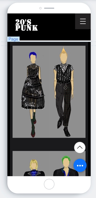
For the web page, I am very satisfied with the result, because it is the first time that I had tried to do the whole process with all the programs by myself. At the beginning, I just designed it in a simple and easy way, I just based on my knowledge to select the buttons from the contact page setting and added the background color crudely. But I wanted to show up with a nice layout result, so I learned how to control and had reference to different website design samples, started to get clear and understood what direction I wanted to be. Tried to design sketches for the background, some requirements on the font and I would choose the appropriate theme and the color I like. I found out that I have slowly added a lot of my personal style inside the webpage. Maybe the layout and design is not the most perfect, and it took a long time to complete, but for the result, I like it very much, and I think it can show and represent who I am. The website created this time also helped me to improve my self-solving problems. Due to this semester being a special situation, there were just a  few opportunities for us to ask questions. Although the tutors are very willing to help, based on the fact that they are affected by the place and time. It is difficult to solve the problem immediately. Therefore, I will go to various online media to find out solutions. I follow the steps in the film to adjust step by step, and try to complete the direction I want. It may not be successfully researched in a short time. But every time a challenging problem was solved, he kept pushing me forward, allowing me to learn the skills to become more aware of software and easily apply it in the future workplace.


Tuesday 8 December 2020

Process of collection three - Women

 For this collection of female design, I had kept the original work and added some decoration on the outfit, here I will showing the process and decision that I had made .
Same step as usual before, opened the file on a new page by using procreate. Used the ‘ 6B pencil ‘ tool on the app, followed and sketched out the model template. Started to outline the upper part design on the second layer. Because I wanted the design to be more feminine and can highlight the shape of women, so I just designed the jumpsuit with a plunging neckline and midriff outfit.


I had a new idea for the lower part - a see-through blommer design. I wanted to have a try and know how the result can be, so I just opened a new layer and used the brush tool ‘ hazy ‘ to paint a simple base color on the pant. However, I thought the result is a bit over revealing and I did not like the texture with the design, so I just turned it back to my original one.


Colored the background of the leather pant with black by using the brush tool ‘ Mercury ‘, and returned to use a smaller brush for drawing the shape of shadow and the way of wrinkled. Added the iconic accessory with iron chain and ribbon to enrich the whole design.


As I had mentioned before, in order to balance the appearance of the upper and lower body, I decided to add a military jacket as a shawl, and then designed a few symbolic texts on top, same with the male's one.


Reference of the Roma shoes :

https://plaka-sandals.com/products/sahara-classic-black

Finally tighten the trousers and tied with the ropes on top which connected with the  Roma shoes.

The final result :


Process of collection three - men

 From my previous post, it's known that the theme for the third collection was the letter painting. And then combining the over size oxford shirt and vest for adding this year fashion element, I will show you the the process and describe it through word.

Same as all design, opened the file and started with the most important process, draw out  the model template by using the ‘6B pencil’ tool of the app first. To be continued, added a new layer and used the brush tool ‘Mercury’ which had shown in the tool list, to sketch out the shape of the leather pants. I used to have an idea that to design a slacks, however I thought it was too bloated when I had combined the oversized top and pant together, so I just designed it to be straight leg size pants. 


I had referenced a men who wearing the leather pant, it helps me to observe the brightness or the wrinkle shadow, for imitate its texture.

 https://www.higgsleathers.co.uk/index.php?CATEGORY=2&SUB=21

And then after adding the details of the leather pant, moved upward to create a white oxford shirt, kept creating a new layer for each step. Used the same tool which was the third button of the left hand side, circle out the area that I wanted to paint and created a basic background for the shirt. Next step, turn back to another smaller brush, tune the size and density of the setting, slightly draw out the shadow and the cutting with the brush.


Reference of the leather jacket :

https://i.pinimg.com/originals/ab/e2/a5/abe2a5c1f9a2fa0298789c6add4e4497.jpg

For the tool vest design, I wanted to mix with two fabrics, the bottom was leather and the upper part would be used with nylon webbing. I had also referenced the image which had shown on the head, there can be known what element and important details that I needed to add with my design.

Reference of the Roma shoes :

https://www.ebay.com/itm/Men-Roma-Gladiator-Punk-Rock-Real-Leather-High-top-Beach-Sandals-Shoes-Slingback-/254458785938

Finally hided the layer with the vest design, added a few letter words on the skirt by using some sharp color, such as cobalt blue, red and green. 


Final result :


Collection three : draft and concept


The theme of the third collection that I had used was - The Letter Print. This was another representative outfit of the punk period.  Due to some history of punk , it used to be a rebellious musical movement. The purpose of the early period was to fight for some popular music forms, such as progressive rock and heavy metal.  But later on, it just evolved into a subversive, rebellious, and anarchist.  At that time, the trend of punk had painted the social problems' main words on clothes as a demonstration.  
Therefore I had used this concept combined into the third collection. What I had combined with this year's fashion trend element? Faux Leather Jumpsuits and Boiler suits. These versatile and edgy one-pieces act as whole outfit from one garment. I thought it just kept it cool in black color and I wanted to add more maturity and be more feminine, so I decided to design a bikini shape in the top front, to highlight the body shape with the women.

Reference of leather jumpsuit and the letter painting outfit :


Left :https://www.whowhatwear.co.uk/leather-jumpsuit-trend

Right :https://www.tumblr.com/tagged/punk-jacket


Started to create a draft with model template bu using 2B pencil again and then added some outfit design on top by using ink pen.


In the previous zebra print collection two, it can be seen that I had tried to design a men who wearing up with a thin and droopy trousers, and tie a band around the ankle. But it was not successful and can be seen that it was not suitable for pairing up with boys' doublet, so I wanted to challenge again on the female one . In order to balance the appearance of the upper and lower body, I added a military jacket as a shawl, and it will also be designed with symbolic text on top.


Added the detail and shadow on the final draft.
Final result :


For the male design, used the same concept of the letter painting style. I would design it by combining two of the popular trends of this year : The tool vest and the oversize oxford shirt.The utility garments, such as tool vest and cargo pants were really popular on this year, it felt vintage but still glitzy, liked bringing all of us back to past again.  

Reference of oversize oxford shirt and tool vest :

https://medium.com/greyjournal/mens-fashion-trends-to-look-out-for-in-2020-c10677a899b9

https://f-trend.com/blog/utility-fashion-trend-2019

Did the same step, using 2B pencil to sketch out the model first, and then started to add the design on top by using ink pen, finally erased the pencil draft and color the outfit with water color marker. 


I had design the letter painting on top of the shirt, and then carry on a vest which without any pocket design, but there would be added different punk style metal element. 


Finally I design up with a leather trousers which was always being the trend of every year, a simple design without any cutting can also be looked fashion and wearable all the time.


Final result :


Monday 7 December 2020

Process of collection two - Women


For this collection of female design, I had kept the original work and didn't edit something new at all, so here will be just showing the process in this blog .

There was a little difference with other design starting points, after repeating the same step of creating a model template. According to the theme of this collection- zebra print, and combining the characteristics of the fishnet, created a see-through for the skirt as I said before, I had to paint the skin color as a base color first, so that I can view up the effect when I was keep adding the design on top, to definitely was it too high density or too low density for the overall.

To confirm all of the characters were using the same color tone, I went back to the male design page, copied the color of his skin tone, and then remarked down the color next to the template.


Used the third of the left hand side tool again ( the blue one ), sketched out the short jumpsuit space area and then filled it up with white color on top first. In addition, to imitate the pattern of the zebra pattern, I had used the same skill with the male design, used the same brush ‘ syrup ‘ which had shown in the tool list to draw out the zebra pattern one by one detaily again.


After finished the short jumpsuit, I used the same brush and turn it into a bigger shape and a lower density to paint out the base color with the full skirt, which was for imitating the see-through effect.


Changed back with a smaller brush or marker which had also been shown on the tool list, using these to add the detail on the skirt. However, when I was processing the sketch on top, I had realized and thought that the size was not big enough and it can be more fluffier, so I just erased the layer and enlarged the size by using the same color one more time. After editing the shape, and then kept continuously adding the shadow or brightness on the design, combined the punk element : zipper, iron banded  other decorations on top of the design.


For this time I had added with a sharp blue hair color style, and a short hair cut which can represent the wild style of the punk period, it felt really cool and stylish. Also I had added some basic decoration like iron and black neck chain on top.

Final result :


Feedback and UX Testing - Improved

Based on the last time, I had collected a lot of useful information from the google form, in order to improve and give out a better customer experience. In this blog, I am going to show where I had edited and re-did with the website, followed and reflect the feedback which common from the customers.

1. Viewing home page of mobile phone
It used to be complicated on the home page, and the words had been covered by each other, so it was hard to see what they were typing about for the viewing of customers. Therefore I had tuned the size being smaller and organized the word in an order, it can be seen the design of the background and topic became clean again after I edited it.

Before: After:

2.too simple with the color
For the second problem, it was too dark style and simple for the color of the collection page. So in order to mix up some iconic elements with punk, I had to change the background color of the collection to be aqua color and the page color be dark green. It just brought out a fresh sense but didn't slashed out the dark style. So I was pretty satisfied with this combine. 

                                              Before :                                After :


3. Copyright

Before :

After :


Process of collection two - Men

For the collection two with male design, I had also made some changes with the draft and I was going to point out where and what I had decided to add or take off.

Due to the concept of collection two was Zebra print, so I had researched some zebra images on the internet, studied some detail with their pattern and shape.


https://society6.com/product/modern-safari-animal-print-black-and-white-zebra-stripes_stretched-canvas

Started the same step with collection one, opened the template file that I had already drawn before, and then used the '6B pencil' which had been shown in the tool list on the app, sketched out the model's body proportions. After drawing out the draft, added layer 3. For this time, I had to measure the size that I wanted, so I did not use the left hand side tool to help me paint with a large area of the doublet. And then I used the brush ‘ syrup ‘ which had shown in the tool list to draw out the zebra pattern one by one detaily. 


I had an idea with another design of pants which was also a popular trend for this year. Wearing up with a thin and droopy trousers, and tie a band around the ankle. It supposedly can highlight the ankle of the legs and modify the body shape, but after I had drawn out by using the procreate and had a look, I thought it had become bloated and looked a bit fertile with the design. So I just did not change and back with the original design at the end.


I had also made the change with the top wear- leather vest. In order to show off more prominent with the zebra pattern, I had designed it to be see-throwing and excavate the space in the middle. Erased the middle on the layer and added back some shadow on top.


For the pants, I used to draw with black checked and brown color for the background on the draft, and also mixed the pattern between the half of the pant. But after I did some research, I thought that I could put more color inside the design. Punk was not just all about black and white, there were also combined with different dark colors, like green and red. So I added with grass green and fire red to line out the pattern with the checked pant.


Finally, added some decorations , such as the iron chains, the tiny waist bad, and designed a hairstyle for the character.

Final result :


Sunday 6 December 2020

Collection Two : draft and concept

Beside the collection one, I had another concept for the collection two - Zebra print. Animal prints have always been the fashion trend in every year, and zebra was the most popular for this year's trend, so I picked this element for the collection. On the other head, I had used the common punk iconic streetwear outfit - fishnet. In punk culture, no matter the bottoming shirt, pants or pantyhose, you can saw fishnet this element in everywhere, those females liked to wear a fit size leather jacket, a muslin skirt and a fishnet tights, it felt like being more sexy but still cool at the same time, a combination of rebellion and breaking regulations outfit.


 Reference with the zebra print and muslin skirt :


Left :https://evoke.ie/2019/12/31/style/fashion-fix/get-ahead-of-the-fash-pack-2
Right :https://u1115759.wordpress.com/2012/02/17/1970s/

So again, I repeated the same step, drew out a model template on the paper by using 2B pencil first, and then used an ink pen to repeat and copy the sketch, darker the line for being more convenient to view with the step. Colored the design as I said before, from light to darker side.


I had used the characteristic of the fishnet, created out a see-through effect for the skirt, so thin to transmit light can bring out the zebra print short jumpsuit inside.


The main concept of collection two for male style, I wanted to keep the element with zebra prints, it would be designed on the doublet, and I wanted to add on a leather vest on top. Secondly, for combining the Punk element, I had used the concept of checked pants, in the past, asymmetry and mixing were also a representative of their unique styles, most of their pants design was separate into two sides, mostly combining the same checks pattern but in different colors. So I decided to combine this two element together and create out a new image for 20's punk.


Reference of Zebra print and punk style checked pant :


Left :https://aeworld.com/fashion/fashion-men/this-is-how-you-should-be-wearing-animal-print-according-to-the-ss20-menswear-shows/
Right :https://punkerskinhead.tumblr.com/image/172097506673

Process of drawing out a draft :


The result was temporarily like this :