Based on the last time, I had collected a lot of useful information from the google form, in order to improve and give out a better customer experience. In this blog, I am going to show where I had edited and re-did with the website, followed and reflect the feedback which common from the customers.
1. Viewing home page of mobile phone
It used to be complicated on the home page, and the words had been covered by each other, so it was hard to see what they were typing about for the viewing of customers. Therefore I had tuned the size being smaller and organized the word in an order, it can be seen the design of the background and topic became clean again after I edited it.
Before: After:


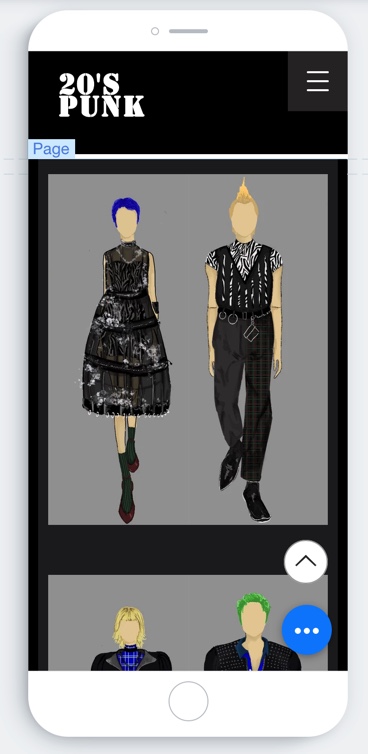
2.too simple with the color
For the second problem, it was too dark style and simple for the color of the collection page. So in order to mix up some iconic elements with punk, I had to change the background color of the collection to be aqua color and the page color be dark green. It just brought out a fresh sense but didn't slashed out the dark style. So I was pretty satisfied with this combine.

3. Copyright
Before :

After :

No comments:
Post a Comment